Understanding the Building Blocks of Visual Communication
Graphic design is the art of creating visual content to communicate messages. By applying visual hierarchy and page layout techniques, designers use typography and pictures to meet users’ specific needs and focus on the logic of displaying elements in interactive designs to optimize the user experience. Here’s a breakdown of the essential elements and principles of graphic design with simple examples.
1. Elements of Graphic Design
Line
Lines can organize information, guide the viewer’s eye, and create textures and patterns. They can be straight, curved, thick, or thin.
Example: A straight line under a headline to separate it from the body text.
Shape
Shapes are defined by boundaries, such as lines or color, and can be geometric (squares, circles) or organic (freeform shapes).
Example: A logo might use a circle to create a simple and memorable mark.
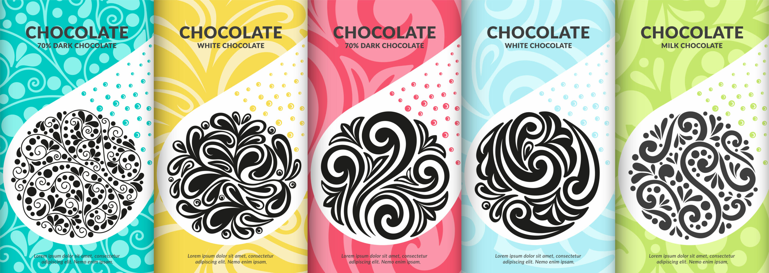
Color
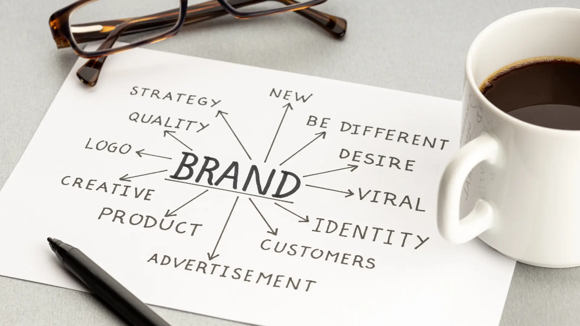
Color can evoke emotions, set a mood, and attract attention. It’s also a critical aspect of branding.
Example: Red is often used to evoke excitement and passion, while blue can be calming and trustworthy.
Texture
Texture adds a tactile appearance to the visual design, making elements feel more real.
Example: Using a paper texture background for a vintage design theme.
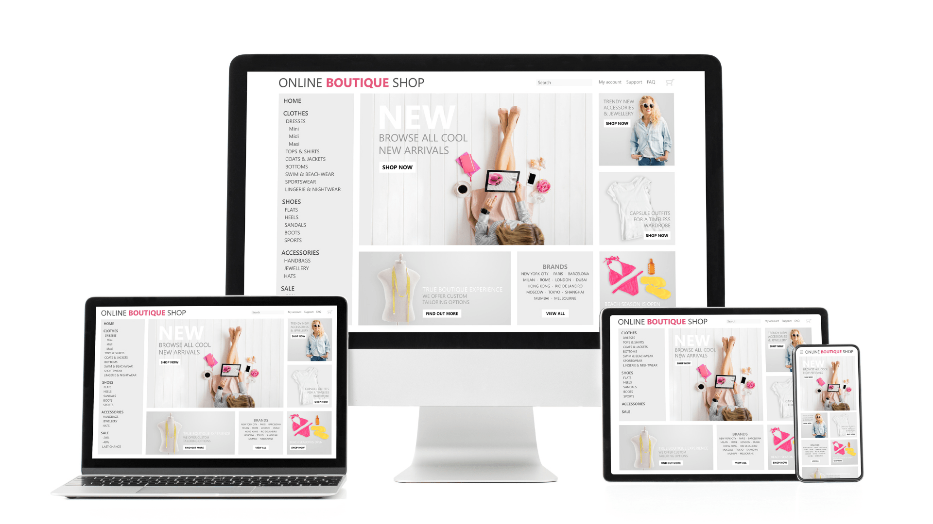
Space
Space (or white space) refers to the empty areas around elements. It helps to reduce clutter and improves readability.
Example: Apple’s website uses a lot of white space to create a clean and focused look.
Typography
Typography is the art of arranging type. It includes choosing fonts, sizes, spacing, and color to convey the desired message effectively.
Example: Using a bold font for headlines to draw attention and a regular font for body text for easy reading.
2. Principles of Graphic Design
Balance
Balance involves distributing elements evenly to create a harmonious composition. This can be symmetrical (elements are mirrored) or asymmetrical (elements are balanced but not identical).
Example: A website with a sidebar on one side and main content on the other, balanced by their visual weight.
Contrast
Contrast is about creating differences between elements to highlight the most important parts of your design.
Example: Using a bright color for a call-to-action button against a dark background.
Emphasis
Emphasis involves making certain elements stand out to draw attention.
Example: A large, bold headline on a poster that immediately catches the viewer’s eye.
Proportion
Proportion refers to the size relationship between elements. Larger elements are often perceived as more important.
Example: In a flyer, a larger image might be used to highlight the main event.
Alignment
Alignment creates a visual connection between elements, making the design more cohesive.
Example: Aligning text and images to a grid can create a more structured and orderly design.
Repetition
Repetition reinforces a design by creating a sense of unity and consistency.
Example: Using the same color scheme and typography throughout a website to maintain a consistent brand identity.
Movement
Movement guides the viewer’s eye through the design in a specific direction, often toward the most important elements.
Example: A diagonal line or a path that leads the viewer’s eye from the top left to the bottom right of a page.
Simple Design Project Example
Let’s put these elements and principles together in a simple project: creating a flyer for a community event.
Step-by-Step Flyer Design
- Choose a Color Scheme: Use a primary color (e.g., blue) and an accent color (e.g., yellow) for contrast.
- Select Typography: Use a bold sans-serif font for the headline and a readable serif font for the body text.
- Create a Layout: Divide the flyer into sections with clear headings for each part (event details, date, location).
- Add Images: Include a relevant image, like a picture of the venue or a previous event, to attract attention.
- Balance and Align: Ensure elements are balanced and aligned to create a clean and organized look.
- Use White Space: Don’t overcrowd the flyer. Use white space to keep it readable and visually appealing.
- Highlight Key Information: Make the event name and date prominent to grab attention immediately.
By following these basic principles and elements, you can create effective and visually appealing designs that communicate your message clearly. Happy designing!